
Including data in a presentation is often unavoidable. And it can also present a problem: The more data-heavy your slides, the less your audience is likely to retain. And as we all know, slides crammed with just numbers can quickly put an audience to sleep. So what’s the answer? Data Visualisation!
One of the best ways you can overcome this challenge is to visualise data by converting a spreadsheet full of data into a series of key messages across a number of succinct slides. This can be done using a variety of data visualisation techniques, for example: including powerful images, impactful charts, and contemporary graphics. Visualisation will help you keep your presentation engaging and slides clean while also clearly presenting trends, problems and patterns.
Here are some other benefits of using data visualisation in presentations:
Avoids heaps of data fighting for attention on your slides
- Makes it possible for your audience to process data faster
- Easily highlights critical trends and patterns
- Clearly presents solutions and actionable items
However, not all data visualisations are created equal. What type of approach you choose would depend on the nature of your data – is it a comparison, a trend or a time-based analysis? By choosing the right visualisation, you can create meaningful charts from complex data to show information impactfully. Read on to know how you can visualise data by choosing the right method.
BUT WAIT! Simple Text is Great When You Have Just a Couple of Numbers to Share
When you have just a number or two to share, ditch complex visualisations. Creating a complex graph in this situation can diminish the impact of the numbers. Instead, plain text is the most effective.
For example, we might want to highlight that the average age that women marry has increased 10% in just 10 years to 33 years old. Burying this statistic in a detailed graph would potentially reduce the startling nature of this fact.
Instead, the below approach can capture your message and make it more retainable:

Tip: Remember to keep the text short and format it in an easy-to-read manner so the numbers or trends you want to share stand out.
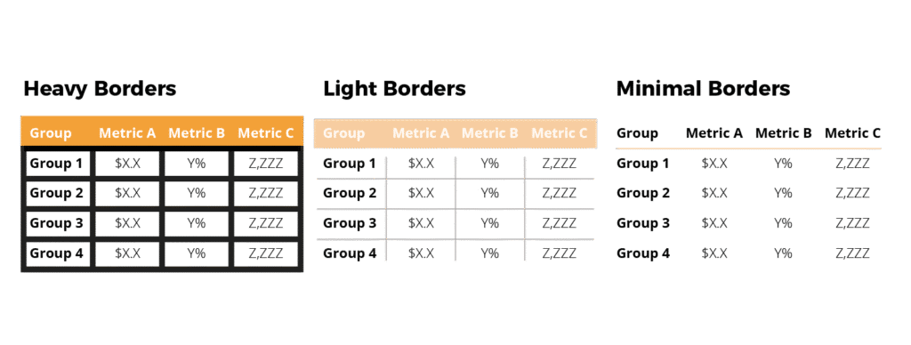
Tables with Multiple Rows and Columns May Confuse the Audience
When you have more data to show, a table may be the first thing that comes to mind, right? However, because there are multiple rows and columns in a table, they’re not always best suited for a presentation slide. When people see a table on a slide, their focus will almost entirely shift to the table, and what you’re saying may not register with them.
Instead, try to pull out and visualise the most important data from the table. You could also include a single high-impact ‘headline’ sentence, as mentioned above. As an alternative you should consider moving the table to the appendix or provide a link that your audience can refer to later.
If you simply cannot avoid using a table, do so without prominent ‘design’ elements like heavy borders and shading. Instead, let the data itself stand out by using minimal shading, a white background and light borders.
Here’s a comparison of three tables with the same data, which shows how the numbers stand out as design elements take a backseat:
Using Different Types of Graphs to visualise data in a Presentation
When it comes to a presentation deck, a clear, well-designed graph will help get information across better than a table with multiple rows and columns. Deciding on which graph type to choose depends entirely on what you want the data to say.
Let’s look at some of the most common graph types and what scenarios they’re best suited for:
Line graphs clearly compare trends over a period of time
Line graphs are your best option when you want to clearly compare a trend over a period of time. The beauty of the line graph is that it helps keep your slides clean by displaying single or multiple series of data at different points in time.
For example, if you want to show how the average age that women marry has increased over a decade, a line graph can work quite well in visually representing the change over a period of time.
Bar graphs help compare data between different groups
In her book, Storytelling With Data: A Data Visualization Guide for Business Professionals, Cole Nussbaumer Knaflic writes, “Sometimes bar charts are avoided because they are common. This is a mistake. Rather, bar charts should be leveraged because they are common, as this means less of a learning curve for your audience. Instead of using their brain power to try to understand how to read the graph, your audience spends it figuring out what information to take away from the visual.”
It’s easier for our eyes to compare the lengths or endpoints of each individual bar in a graph and absorb data almost instantly, as per the image below:
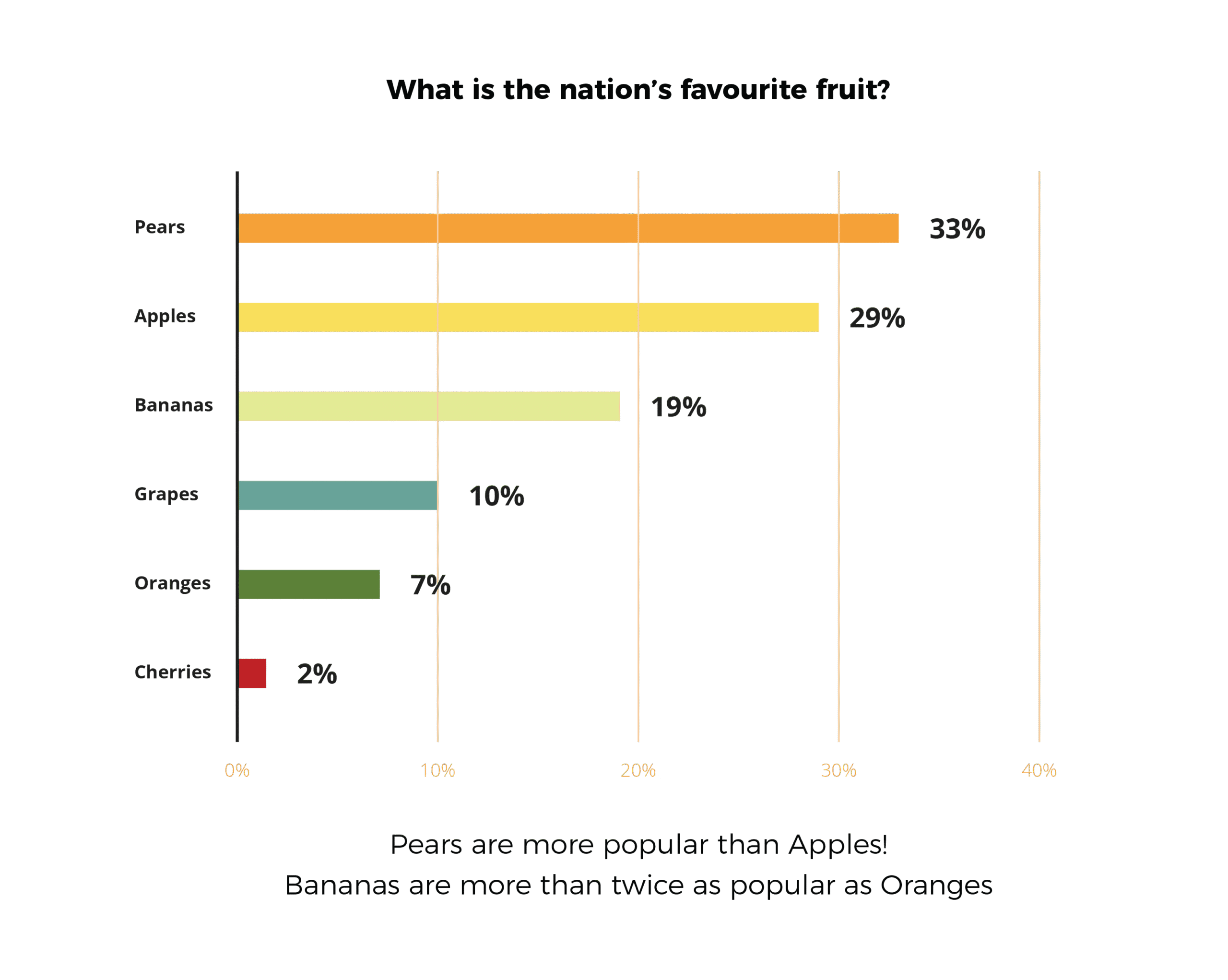
Depending on how you want to order your data, you can use horizontal or vertical bar graphs to present it in an easy-to-read format.
Tip: Avoid using too many columns or bars for comparison as this can clutter your slide and confuse your audience. If you have a lot of variables that must be added to your slides, consider using multiple comparative charts.
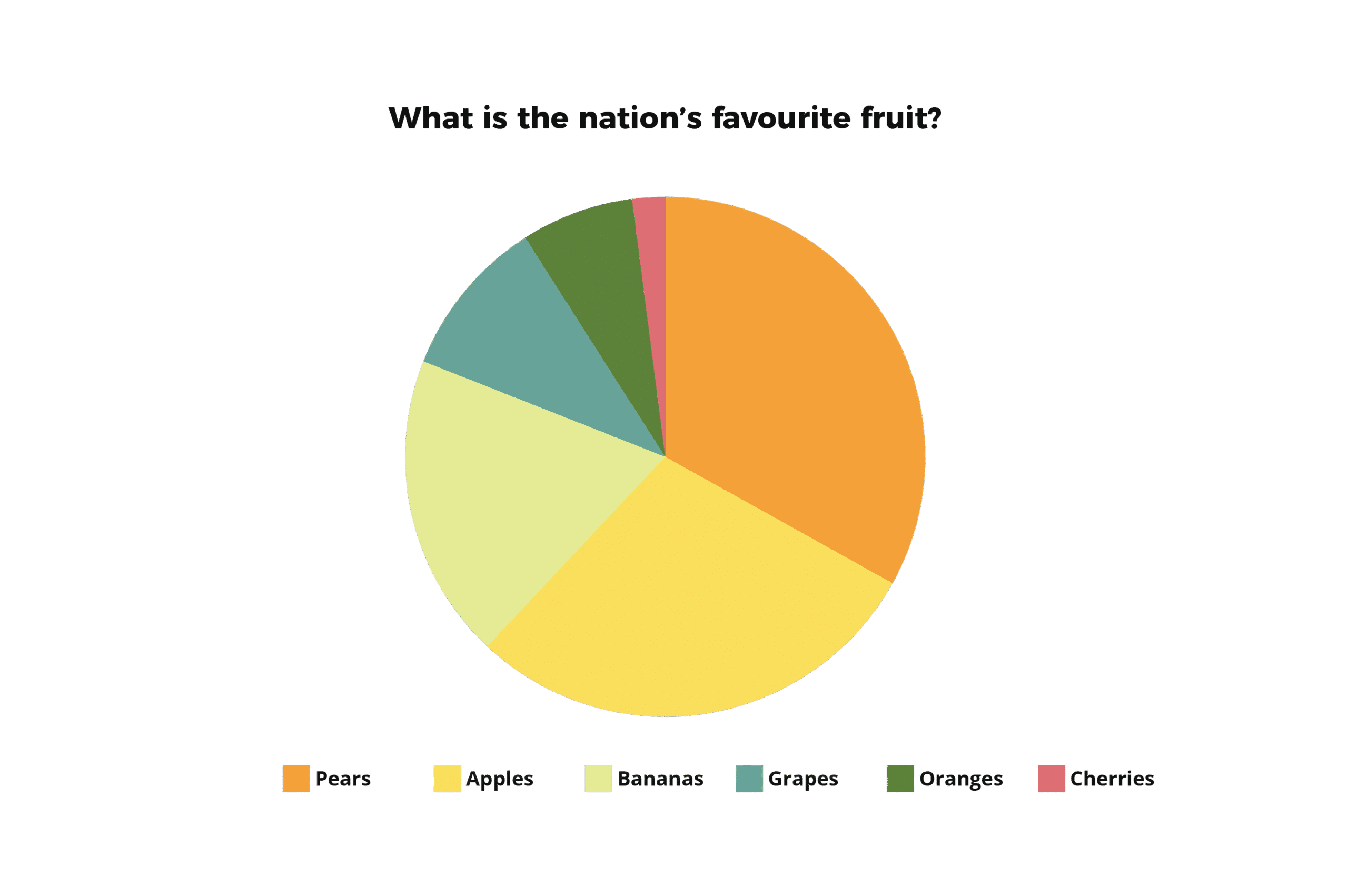
Pie charts should be used with care
Pie charts come very close to bar graphs in popularity, but when used in a presentation, they can be misleading. The problem with pie charts is that they force the human eye to compare areas (or angles), which may not provide an accurate picture.
For example, in the pie chart below, your audience may find it difficult to understand the share of each segment if you used only the legends without any data labels. These are the worst kinds of pie charts to use because people can’t make out or measure the angles accurately:
Next, let’s look at the same pie chart with the legend, plus data labels. Looks more helpful than the one above in showing your audience the share each section holds, right?
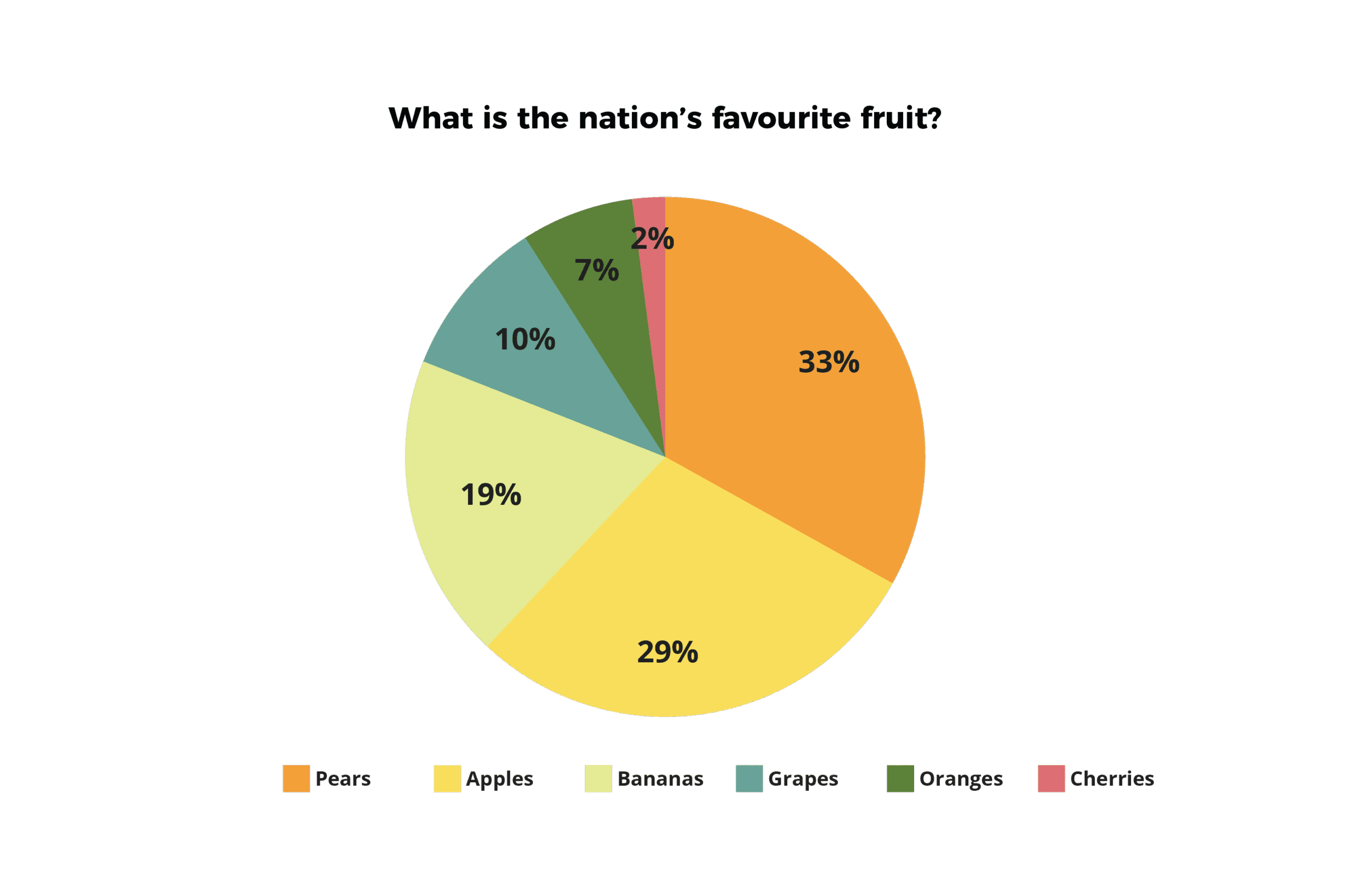
Finally, here’s an example of how a pie chart should ideally be presented: Complete with a legend, data labels, a headline and a summary that captures the main message. These are the best kinds of pie charts to use when visualising data:
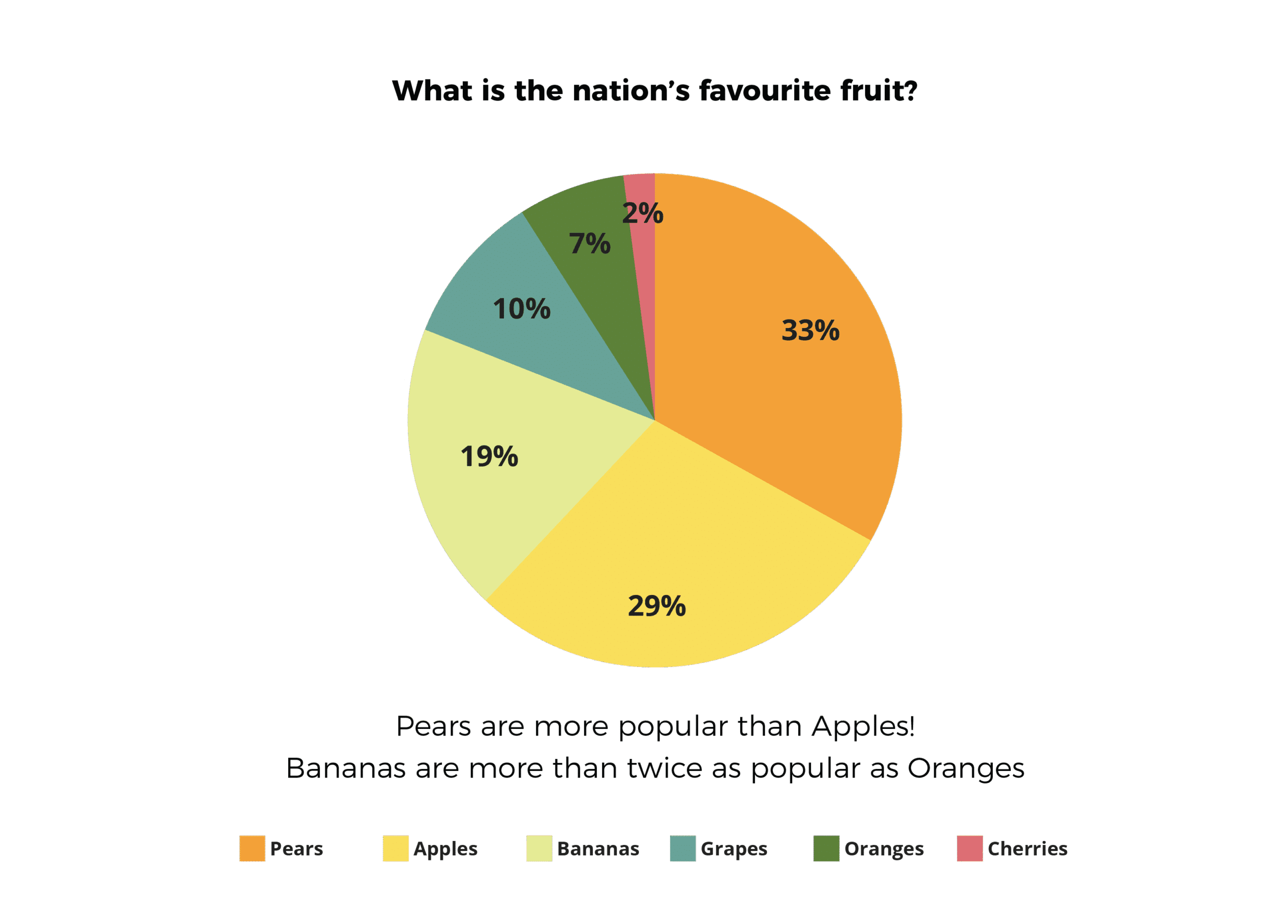
Tip: Always make sure the legend is easy to read, and order the legend in the same way the data is ordered in the chart. Even better – name the elements being measured (in this case pears, apples and so on) within the chart itself. In the case above this isn’t visually practical because the segments for oranges and cherries are too small.
When in doubt, I recommend sticking to a bar chart. It is often more effective than a pie chart in creating a clear picture of the parts-to-whole relation.
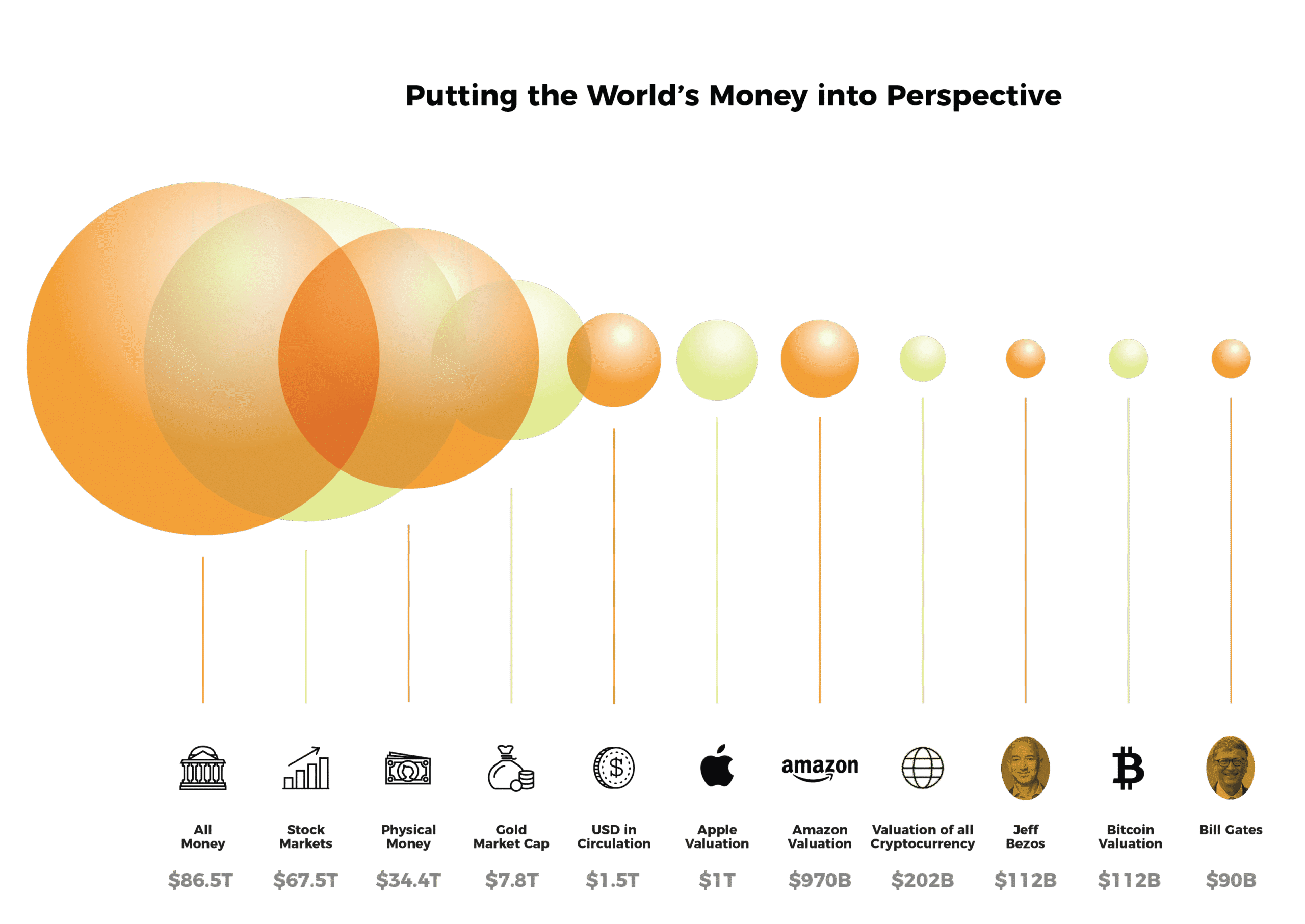
Bubble charts can help visualise heavy numeric data
A bubble chart is particularly effective when you have massive amounts of numeric data that needs to be conveyed in a single glance. What makes the bubble chart really versatile is that it can help you represent up to four dimensions in a single graph without overwhelming your audience.
A bubble chart works well in clearly and concisely comparing numeric information such as the market share of your top competitors or how bigger ad spends led to increased sales over a certain period of time.
If you’re planning on visualising data using a bubble chart, make sure you label each element of the chart clearly. Otherwise, there’s a strong chance that audiences may misinterpret data.
When should you not use a bubble chart? A bubble chart is not the best choice when you want to put forth qualitative data, such as, why a problem has occurred and how it can be solved.
3D charts could obscure data
It can be tempting to use a 3D chart because it looks like a novel way to present data, and tools like Microsoft Word and Excel make it really easy to create one. But the truth is, these can easily confuse your audience by excessively complicating your data with the use of multiple dimensions.
If you must use a 3D chart, make sure it doesn’t have elements that consume space on a slide but don’t add value.
4 bonus tips to make your data visualisation more effective
Now that we’ve discussed how to effectively use data visualisation methods, here are some bonus tips to reduce confusion and errors in your visualisation:
- Make sure that colours are used consistently through your visualisations and there’s enough contrast so your audience can easily interpret the data.
- Focus the title of the slide on what you want your audience to know, and not what the chart is about. For example, instead of a title that says ‘Car Sales in 2018’, say ‘XYZ was our highest selling model in 2018’
- Rather than using a legend to show multiple data series in your chart, use simple text labels as this saves your audience’s attention from being divided between the legend for explanation and the data for interpretation.
- And, finally, here’s a great overview of common data visualisation mistakes that sets out 10 common mistakes made when visualising data, and how to avoid them.
No matter which style of visualisation you use, remember to keep it simple because information overload can lead to confusion and distraction.
If you want to learn more about becoming a stronger, more creative presenter, get in touch with the Business Presentation Skills Experts at SecondNature.